5 Ways to Seamlessly Blend Old and New in Your Victorian Extension
- 29-07-24
- 6 min read
- Blog
Victorian homes are beloved for their ornate details, high ceilings, and timeless elegance.
However, as modern lifestyles evolve, many homeowners find themselves needing additional space.
The challenge lies in creating extensions that honour the original architecture while meeting contemporary requirements.
The great news is that striking this balance culminates in beautiful yet functional spaces that retain the authenticity of Victorian homes while delivering everything you need for modern life.
Read on as we explore five period-appropriate design ideas that blend old and new for your Victorian home extension.
Bay windows are a quintessential feature of Victorian architecture, adding character and bringing in ample natural light.
Traditionally, Victorian bay windows feature:
Ornate woodwork and mouldings
Multiple panes of glass, often in a six-over-six or four-over-four pattern
A polygonal or curved shape protruding from the main wall
For a modern extension, consider upgrading or swapping your bay windows with the following:
Floor-to-Ceiling Glass Panels: Replace the traditional multi-paned design with expansive glass sheets for unobstructed views and maximum light.
Minimalist Frames: Opt for slim, powder-coated aluminium frames in a dark colour to mimic the look of traditional cast iron while providing better insulation.
Flexible Spaces: Design the bay area as a versatile nook that can serve multiple purposes - a reading corner, a home office, or a cosy dining space.
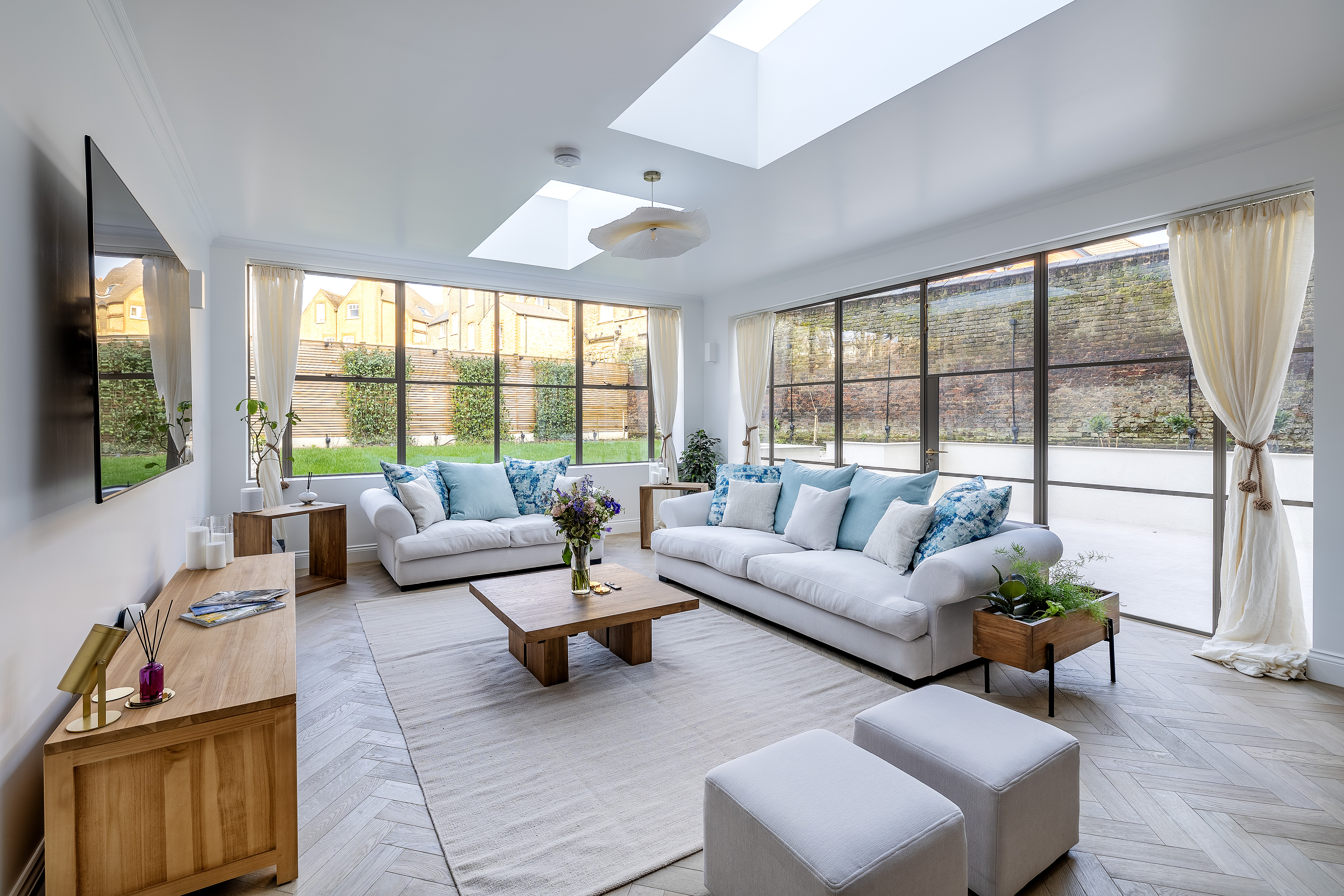
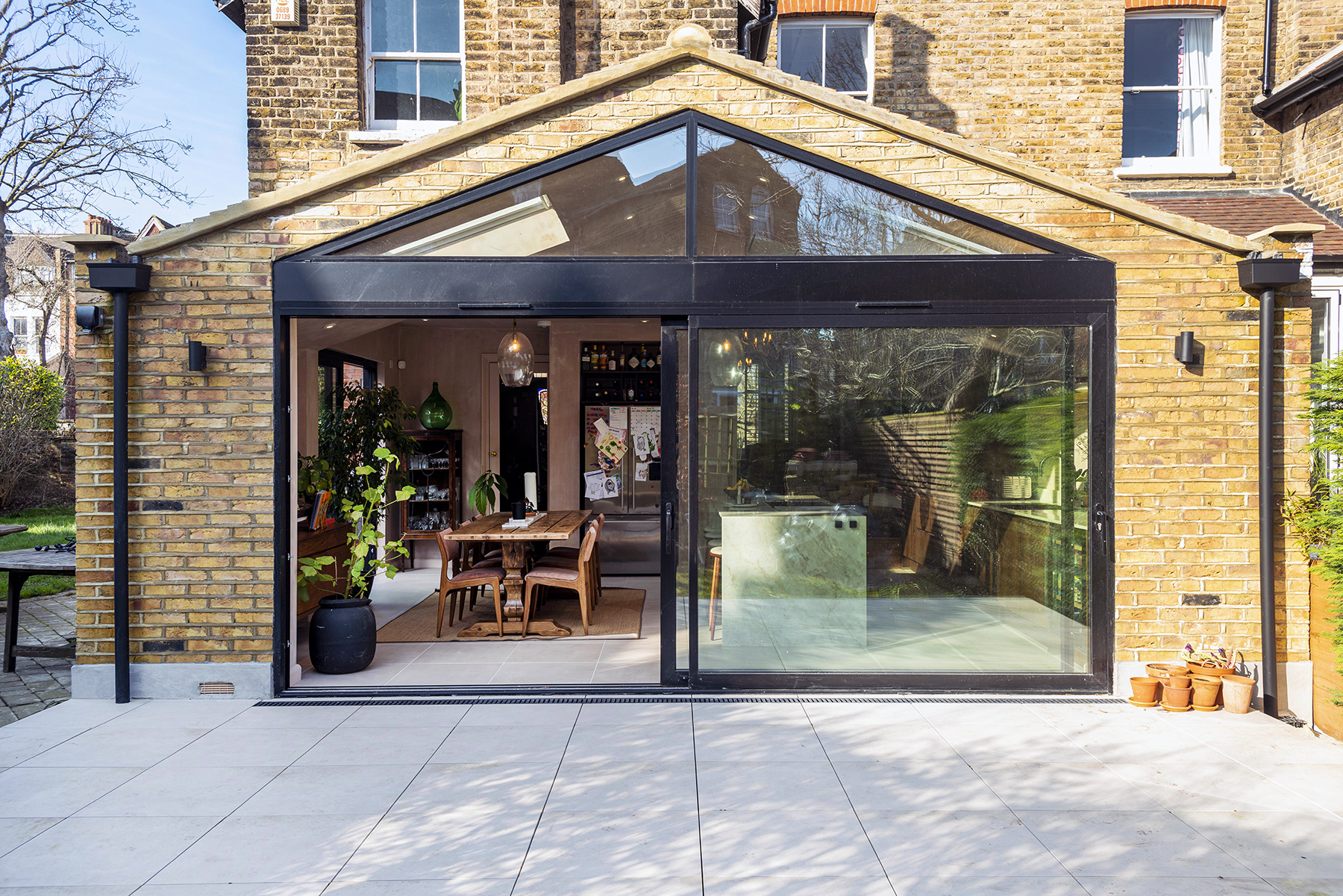
Above: Gorgeous full-height window extension in SW12
By reimagining this classic Victorian feature, you can create a striking visual link between the original house and its modern extension, while also maximising natural light and views of your garden.
Victorian hallways and porches are often adorned with intricate tessellated tiles, creating beautiful geometric patterns.
Classic Victorian tessellated tiles typically feature:
Intricate geometric patterns
A palette of black, white, red, and buff
Small, individual pieces precisely fitted together
For a modern twist on this classic element, consider:
Oversized Patterns: Scale up traditional Victorian designs for a bold, graphic impact.
Unexpected Materials: Use terrazzo (mixed stone chip tiles), polished concrete, or even wood inlays to recreate tessellated patterns.
Colour Play: Introduce a contemporary colour palette while maintaining the geometric aesthetic.
Orangeries were popular additions to Victorian homes, providing a light-filled space for growing citrus trees and exotic plants.
Bringing plenty of light into your Victorian with an orangery-inspired rear extension is a superb way to brighten the entire interior of your home.
Classic orangeries typically featured:
A brick or stone base
Large windows and a glazed roof
Ornate columns and cornices
For a modern take on the orangery concept, consider:
Structural Glazing: Use frameless glass panels for walls and roofs to connect seamlessly with the outdoors.
Minimalist Support Structures: Replace ornate columns with sleek steel or timber supports.
Climate Control: Incorporate state-of-the-art heating, such as underfloor heating, or consider air-conditioning.
A glasshouse-inspired orangery can serve multiple purposes:
Create a light-filled dining area that feels like an extension of your garden.
Design a multi-functional space for a home office, yoga studio, or entertainment area.
Use it as a transitional space between your Victorian home and a more contemporary extension.
To ensure your modern orangery complements the existing structure:
Echo the proportions and rhythm of your Victorian windows in the glazing design.
Use materials that tie in with the original house, such as matching brickwork for the base.
Incorporate subtle Victorian-inspired details, like a decorative glass frit pattern or slender glazing bars.
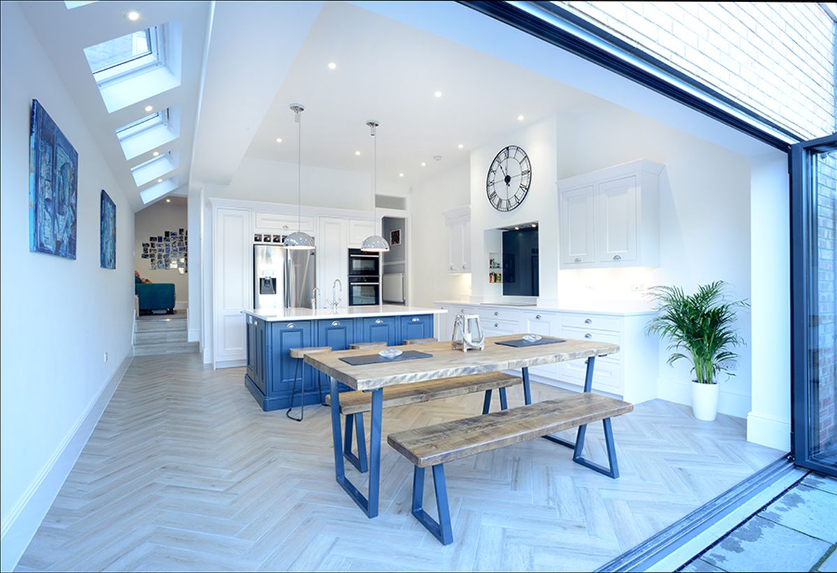
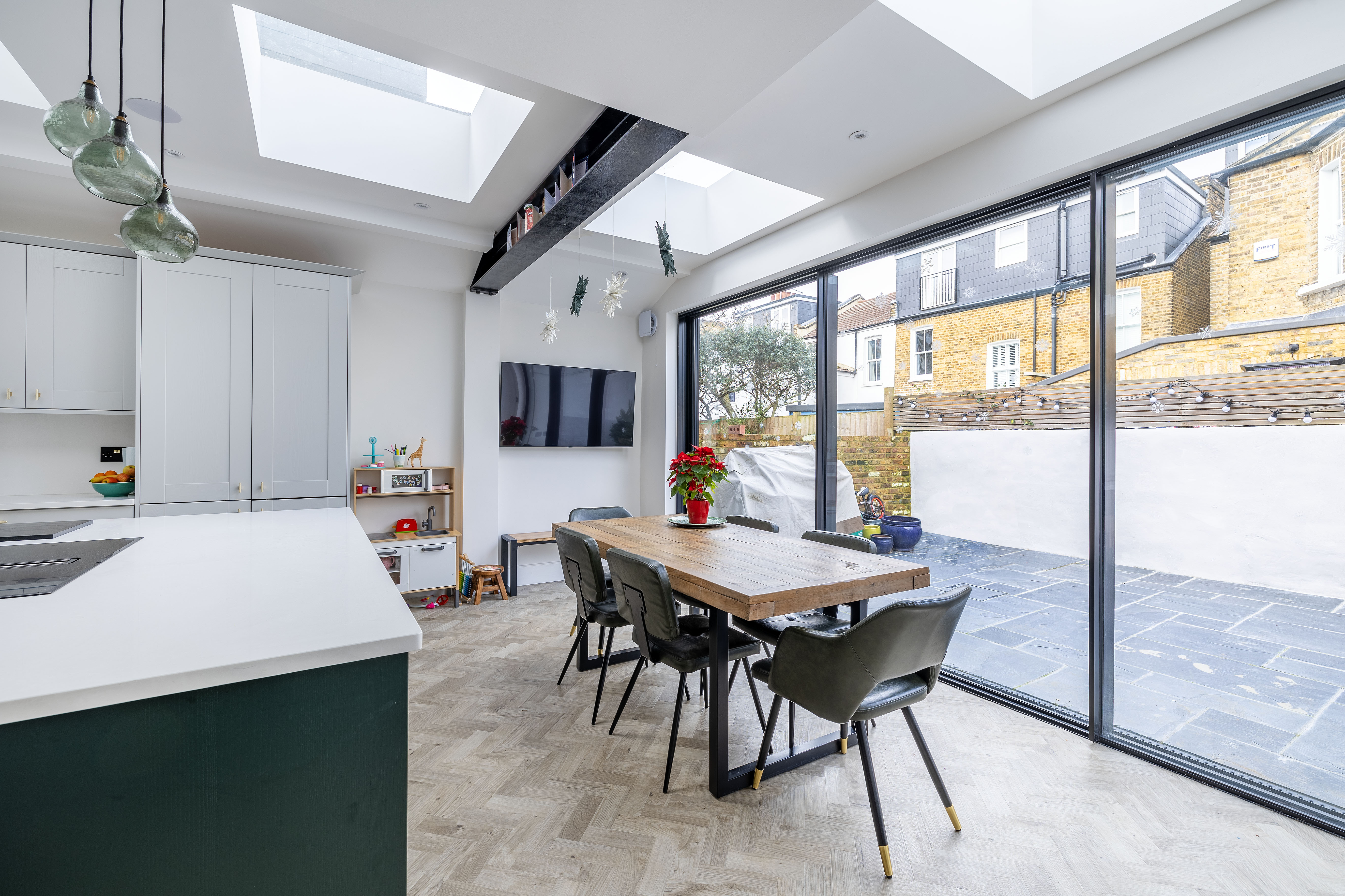
Above: Beautiful bright extension in N10
By reimagining the traditional orangery, you can create a light-filled, versatile space that respects your home's Victorian heritage while embracing modern design and technology.
Cast iron is synonymous with Victorian interiors, most commonly seen in radiators and fireplaces.
However, this versatile material can be reimagined in exciting ways to create striking features in your modern extension.
In Victorian homes, cast iron was typically used for:
Ornate radiators
Fireplace surrounds and inserts
Exterior railings and gates
For a fresh take on this classic material, consider:
Structural Elements: Use cast iron for exposed beams or columns in your extension.
Feature Walls: Create textured wall panels using cast iron with modern patterns.
Bespoke Furniture: Commission custom cast iron furniture pieces that blend Victorian and contemporary design.
Design a cast iron room divider with a contemporary geometric pattern to separate spaces in an open-plan extension.
Create a striking kitchen island with a cast iron base and a contrasting top material like wood or stone.
Install a modern cast iron spiral staircase as a sculptural feature in your extension.
To ensure your innovative use of cast iron complements your Victorian home:
Echo patterns or motifs from original cast iron elements in your new designs.
Use a consistent finish (e.g., blackened or polished) throughout the house to create visual continuity.
Balance the visual weight of cast iron with lighter materials to prevent the space from feeling heavy.
By reimagining the use of cast iron, you can pay homage to Victorian craftsmanship while creating unique, contemporary features in your extension.
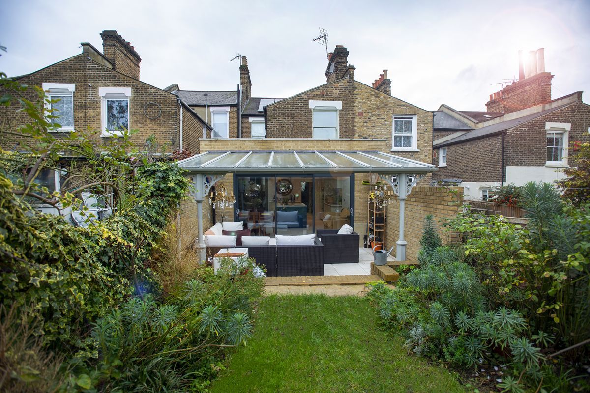
Above: Ornate wrought iron posts for an outdoor seating area behind a rear extension in SE14
Victorian interiors were known for their rich, layered textures and visual complexity. We can reinterpret this concept for modern extensions, creating depth and interest while maintaining a contemporary feel.
Victorian interiors typically featured:
Multiple patterns and textures in a single room
Heavy draperies and upholstery
Ornate wallpapers and intricate carpets
A mix of materials, including wood, fabric, metal, and glass
For a modern take on Victorian layering, consider:
Subtle texture variations in neutral tones
Strategic use of patterns in unexpected places
Mixing modern and traditional materials
Creating visual depth through layered lighting and translucent materials
Textured Wall Treatments: Combine smooth plastered walls with sections of 3D textured panels or modern takes on Victorian pressed tin ceilings.
Layered Window Treatments: Combine sheer curtains, blinds, and decorative screens to create a modern interpretation of Victorian window dressing.
Material Mixing: Incorporate a variety of textures in furniture and decor, such as sleek metal, plush fabrics, and natural wood, to create a rich sensory experience.
Patterned Accents: Use bold, oversized patterns inspired by Victorian motifs in unexpected places like the inside of a cupboard or on a feature ceiling.
Tactile Flooring: Layer area rugs with different textures over hardwood or tiled floors to add depth and warmth to the space.
This allows you to create visually interesting and tactilely rich interiors that nod to Victorian design principles while maintaining a contemporary aesthetic.
The key is to balance the layering and textures carefully, ensuring the space feels cohesive and intentional rather than cluttered.
This is particularly effective in open-plan extensions, helping to define different areas within the space through changes in texture and material.
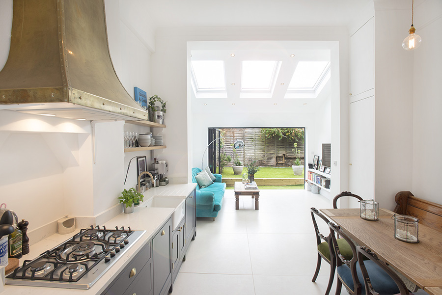
Above: Modern extension with Victorian details in SW2
Extending a Victorian home presents a unique opportunity to create a space that honours the past while embracing modern needs.
The key to success lies in finding the right balance. Each of these elements should be thoughtfully integrated, creating a dialogue between old and new rather than a jarring contrast.
Consider how materials, proportions, and details can be used to transition from the original Victorian rooms to the new extension.
Remember that while these ideas provide a starting point, every home is unique. Work closely with an architect or designer specialising in period properties to develop a bespoke solution that respects your home's character and meets your needs.
Design Team has extensive expertise in Victorian extension design and can help you craft a beautiful, elegant space you can be proud of.
Book your free consultation to get started today.
Book a free Design Consultation with one of our team to discuss your project in more detail.
.jpg)
11-11-24 6
10-11-24 6
25-10-24 6